> ## Documentation Index
> Fetch the complete documentation index at: https://docs.dume.ai/llms.txt
> Use this file to discover all available pages before exploring further.
# Charts - Interactive Data Visualization
> Create interactive pie charts, line charts, and bar charts using @ commands in Dume.ai's chat interface. Learn chart types, customization options, and data visualization best practices.
## Overview
Dume.ai's chart tools allow you to create interactive visualizations directly from the chat interface. Each chart type has its own dedicated function that can be activated by typing `@` in the chat, making data visualization quick and intuitive.
Charts are generated dynamically and can be customized with various styling options and data configurations.
## Chart Types
Perfect for showing proportions and percentages of a whole dataset.
Ideal for displaying trends and changes over time or continuous data.
Great for comparing quantities across different categories or groups.
## Activation Method
Simply type `@` followed by your chart request in natural language. Dume.ai will automatically select the appropriate chart type and generate it for you.
```bash Pie Chart Examples theme={null}
@pie_chart Create a pie chart showing our budget breakdown: Sales 45%, Marketing 25%, Development 20%, Support 10%
@pie_chart Show traffic sources: Desktop 60%, Mobile 35%, Tablet 5%
```
```bash Line Chart Examples theme={null}
@line_chart Show monthly revenue trend from Jan to Jun: 12k, 15k, 18k, 16k, 22k, 25k
@line_chart Display temperature changes over the week
```
```bash Bar Chart Examples theme={null}
@bar_chart Compare product sales: Product A 120, Product B 190, Product C 300
@bar_chart Show team performance scores for Q1
```
Type `@` in the chat to see all available chart options, then describe what you want to visualize in plain English.
## Available Charts
### Pie Chart (`@pie_chart`)
Creates circular charts showing data as slices of a pie, perfect for displaying percentages and proportions.
```bash Basic Pie Chart theme={null}
@pie_chart Show budget distribution: Sales 45%, Marketing 25%, Development 20%, Support 10%
```
```bash Market Share Analysis theme={null}
@pie_chart Create a pie chart for browser usage: Chrome 65%, Safari 20%, Firefox 10%, Edge 5%
```
```bash Survey Results theme={null}
@pie_chart Display customer satisfaction: Very Satisfied 40%, Satisfied 35%, Neutral 15%, Dissatisfied 10%
```
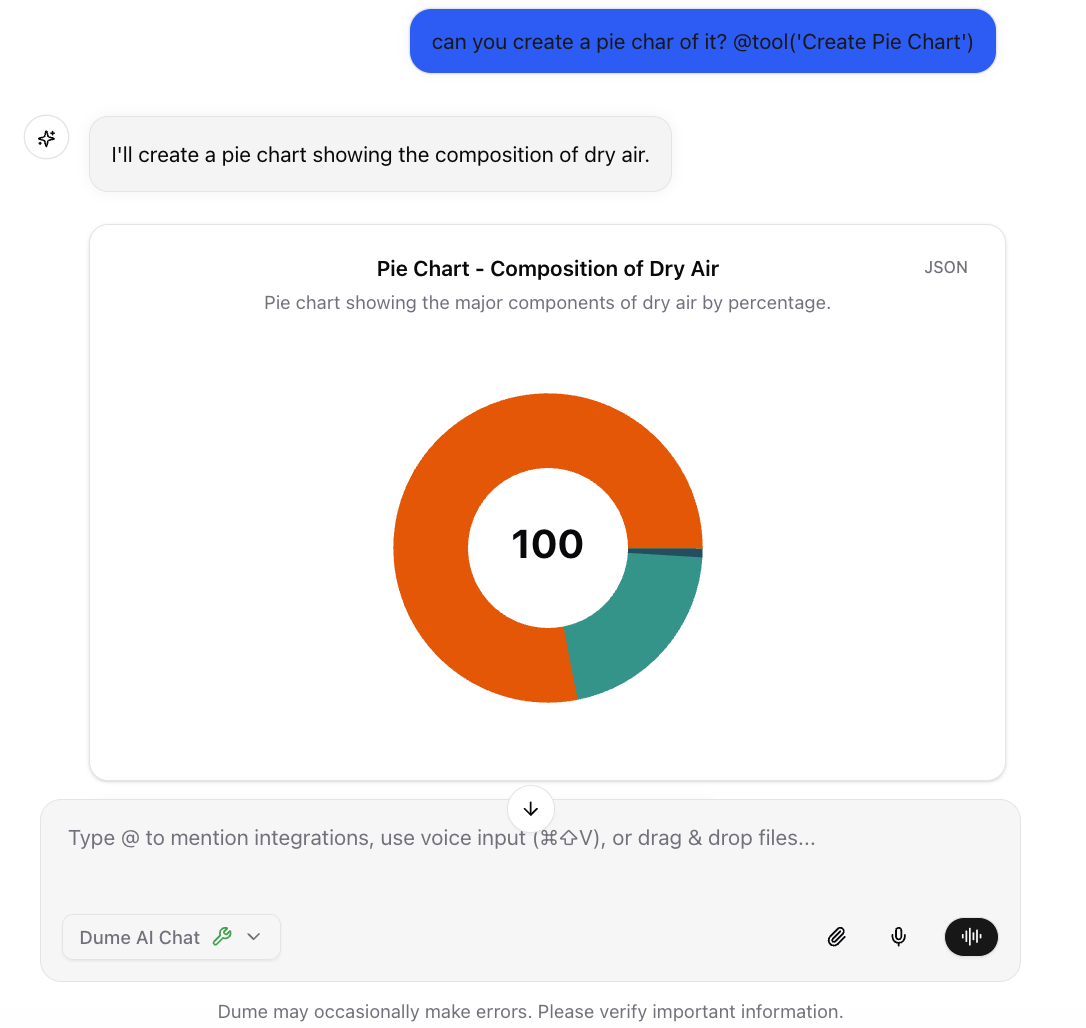
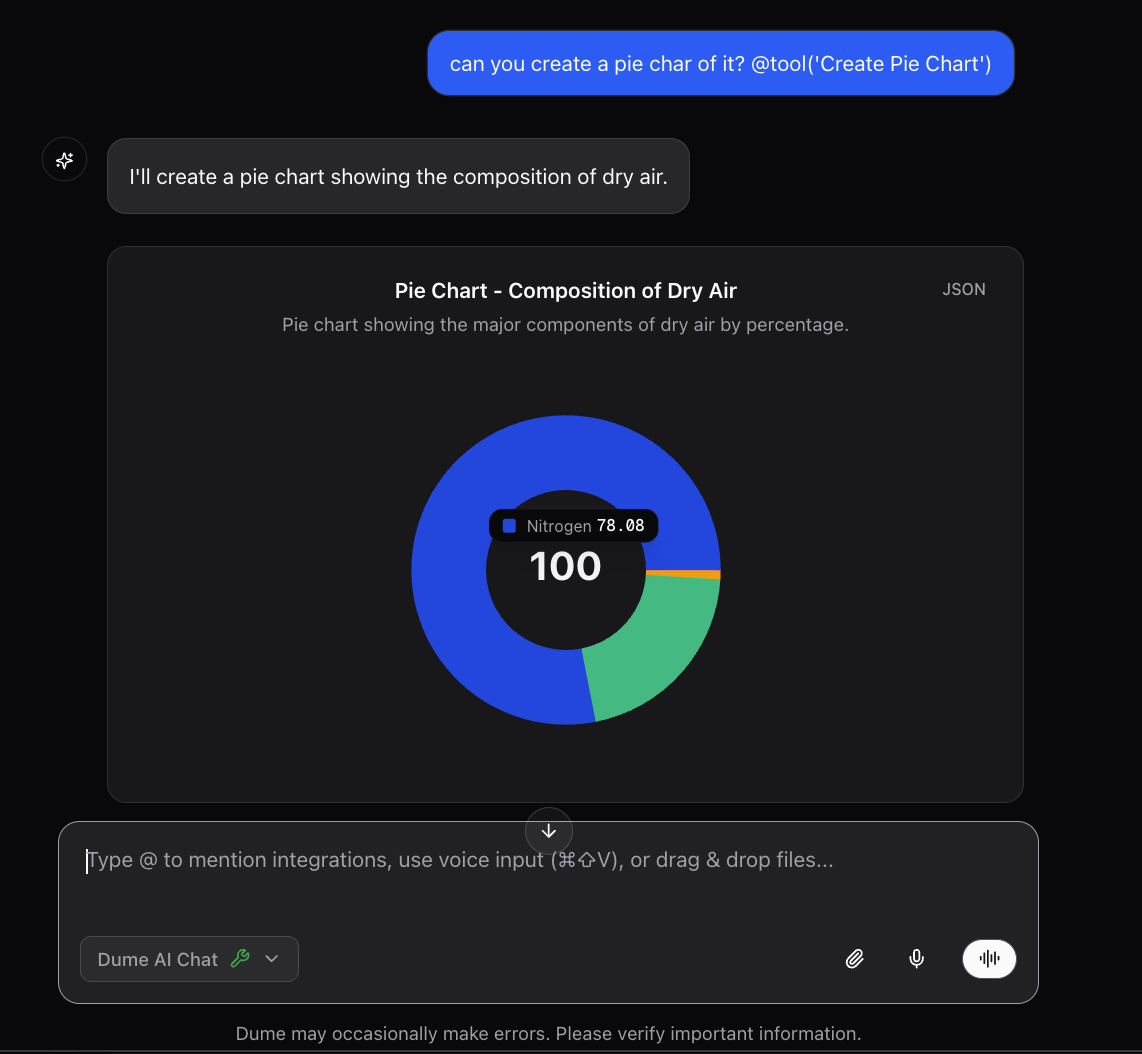 **Common Use Cases:**
* Budget breakdowns
* Survey results
* Market share analysis
* Resource allocation
### Line Chart (`@line_chart`)
Creates line graphs to show trends, changes over time, or relationships between continuous variables.
```bash Revenue Trend theme={null}
@line_chart Show monthly revenue from Jan to Jun: 12k, 15k, 18k, 16k, 22k, 25k
```
```bash Temperature Data theme={null}
@line_chart Display weekly temperature changes: Mon 72°F, Tue 75°F, Wed 78°F, Thu 80°F, Fri 77°F
```
```bash Performance Comparison theme={null}
@line_chart Compare website traffic for 2023 vs 2024 by quarter
```
**Common Use Cases:**
* Budget breakdowns
* Survey results
* Market share analysis
* Resource allocation
### Line Chart (`@line_chart`)
Creates line graphs to show trends, changes over time, or relationships between continuous variables.
```bash Revenue Trend theme={null}
@line_chart Show monthly revenue from Jan to Jun: 12k, 15k, 18k, 16k, 22k, 25k
```
```bash Temperature Data theme={null}
@line_chart Display weekly temperature changes: Mon 72°F, Tue 75°F, Wed 78°F, Thu 80°F, Fri 77°F
```
```bash Performance Comparison theme={null}
@line_chart Compare website traffic for 2023 vs 2024 by quarter
```
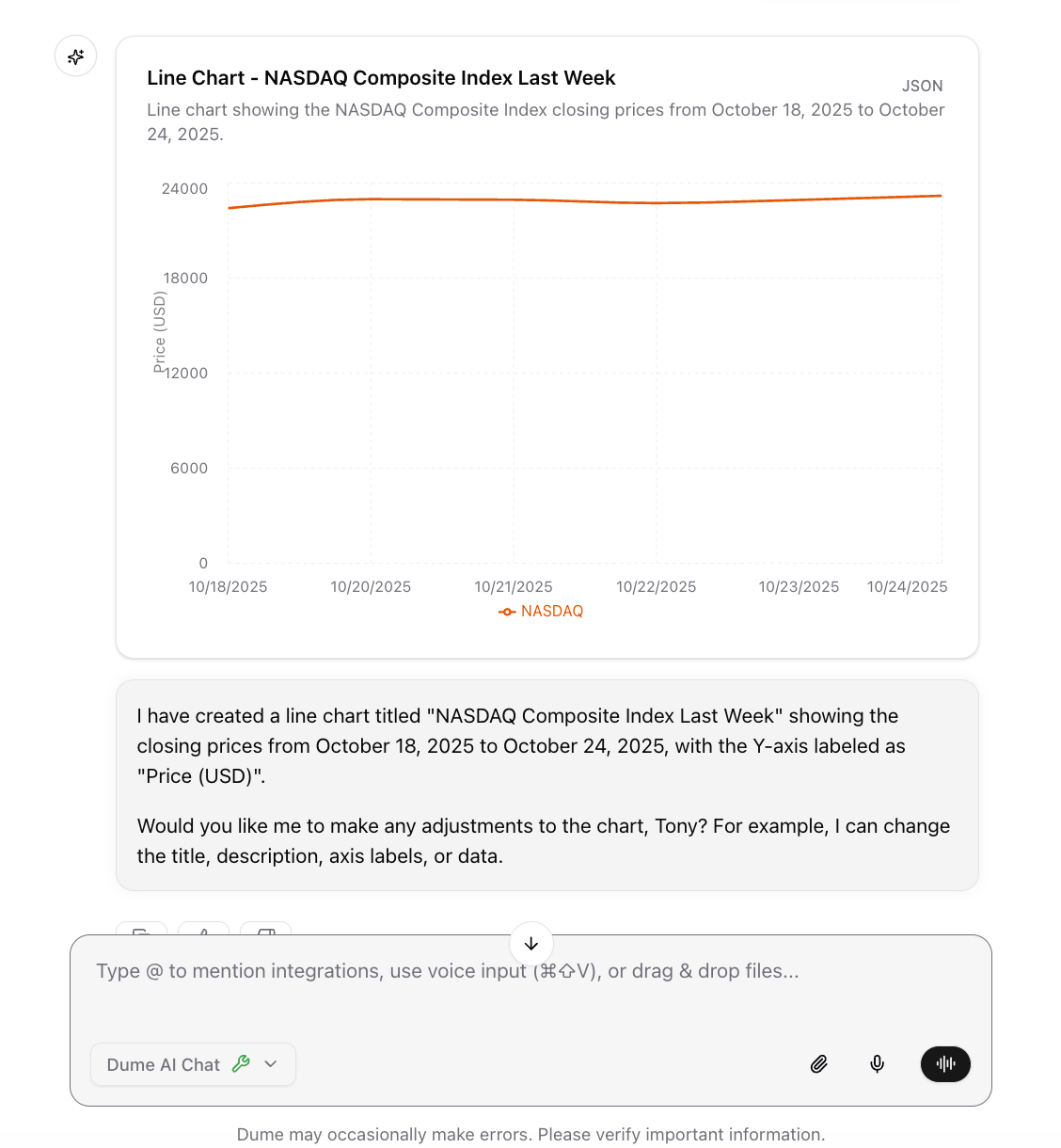
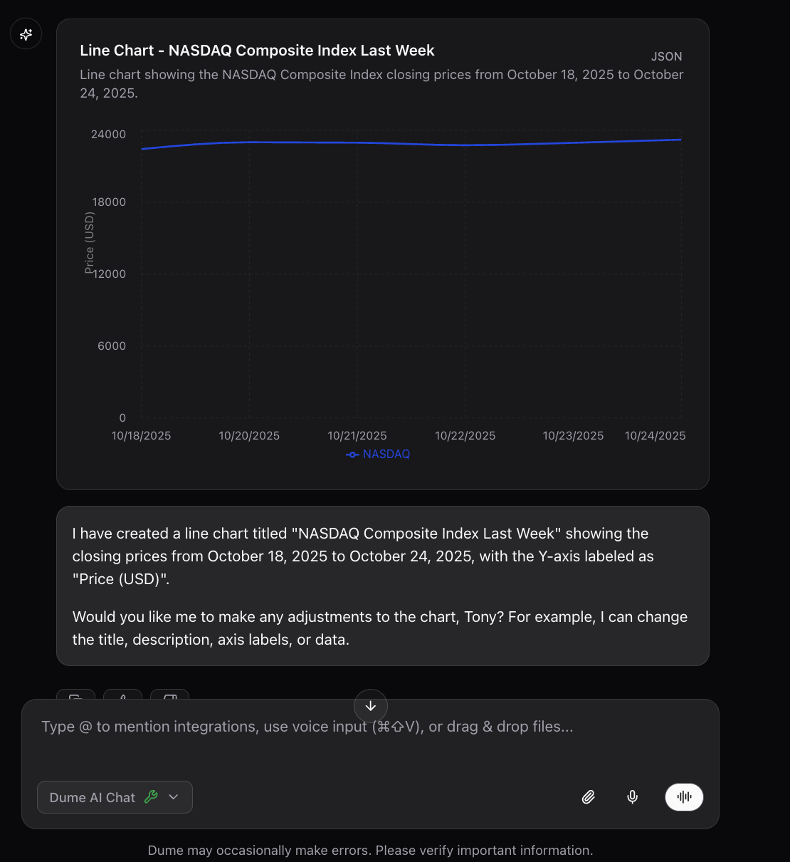 **Common Use Cases:**
* Time series data
* Performance tracking
* Trend analysis
* Comparative studies
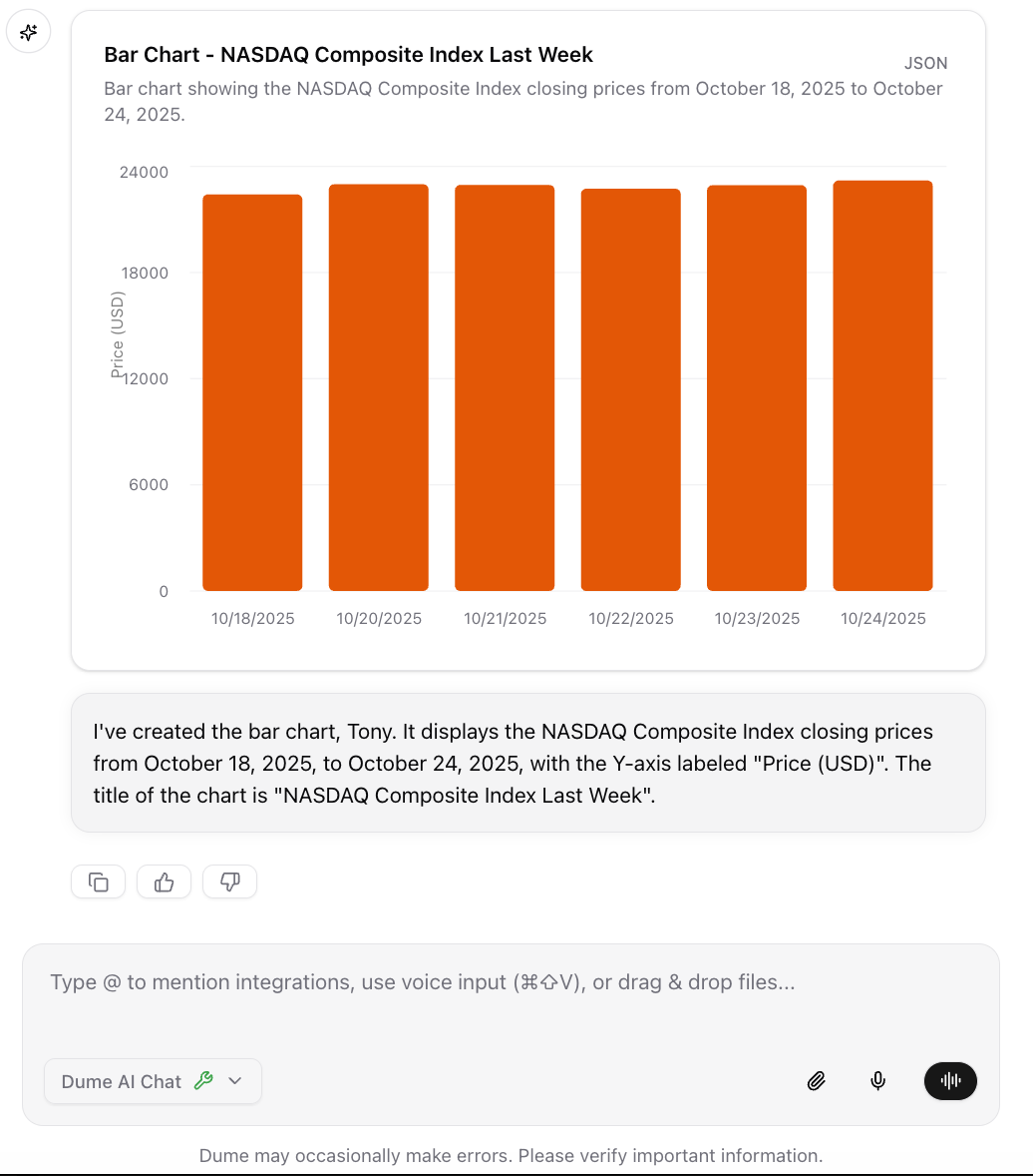
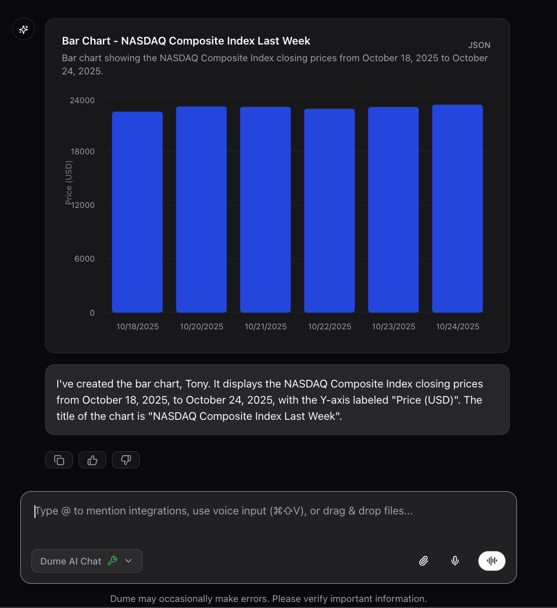
### Bar Chart (`@bar_chart`)
Creates vertical or horizontal bar charts for comparing quantities across different categories.
```bash Product Sales theme={null}
@bar_chart Compare product sales: Product A 120 units, Product B 190 units, Product C 300 units, Product D 500 units
```
```bash Team Performance theme={null}
@bar_chart Show team completion rates: Team A 85%, Team B 92%, Team C 78%, Team D 96%
```
```bash Monthly Comparison theme={null}
@bar_chart Display sales vs leads for Jan-Mar: Sales (50, 75, 60), Leads (30, 45, 40)
```
**Common Use Cases:**
* Time series data
* Performance tracking
* Trend analysis
* Comparative studies
### Bar Chart (`@bar_chart`)
Creates vertical or horizontal bar charts for comparing quantities across different categories.
```bash Product Sales theme={null}
@bar_chart Compare product sales: Product A 120 units, Product B 190 units, Product C 300 units, Product D 500 units
```
```bash Team Performance theme={null}
@bar_chart Show team completion rates: Team A 85%, Team B 92%, Team C 78%, Team D 96%
```
```bash Monthly Comparison theme={null}
@bar_chart Display sales vs leads for Jan-Mar: Sales (50, 75, 60), Leads (30, 45, 40)
```
 **Common Use Cases:**
* Category comparisons
* Survey responses
* Performance metrics
* Ranking data
## Quick Reference
1. Type `@` in the chat interface
2. Choose your chart type (`@pie_chart`, `@line_chart`, or `@bar_chart`)
3. Describe your data in natural language
4. Dume.ai automatically generates the chart
**Example:** `@pie_chart Show our team composition: Engineers 60%, Designers 25%, Managers 15%`
**For Pie Charts:**
* "Show budget breakdown: Category1 40%, Category2 35%, Category3 25%"
* "Display market share for: Company A 50%, Company B 30%, Company C 20%"
**For Line Charts:**
* "Show monthly sales: Jan 100, Feb 150, Mar 200, Apr 180"
* "Display temperature over the week from Monday to Friday"
**For Bar Charts:**
* "Compare team scores: Team A 85, Team B 92, Team C 78"
* "Show product performance across quarters"
* Be specific with your data points and labels
* Include units (%, \$, units) when relevant
* Keep category names short and clear
* Mention the chart title you'd prefer
* Specify time periods for trends
**Good:** `@line_chart Show quarterly revenue for 2024: Q1 $50k, Q2 $65k, Q3 $70k, Q4 $80k`
**Better:** `@line_chart Create "2024 Revenue Growth" showing quarterly results: Q1 $50k, Q2 $65k, Q3 $70k, Q4 $80k`
## Example Workflow
1. Type `@pie_chart` in chat
2. Describe your data: "Show budget: Marketing 40%, Sales 35%, Dev 25%"
3. Chart generates instantly
4. Ask for adjustments if needed
1. Share your data or describe it
2. Type `@bar_chart Compare these quarterly results`
3. Dume.ai extracts data and creates chart
4. Refine with additional requests
1. Type `@line_chart`
2. Say "Show growth over 6 months" with your data
3. Chart displays trend automatically
4. Ask for specific styling or annotations
You can also just describe what you want to visualize without specifying the chart type, and Dume.ai will suggest and create the most appropriate chart automatically.
## Best Practices
* **Use natural language** - Just describe your data in plain English
* **Be specific with data** - Include actual numbers, percentages, or values
* **Choose the right chart type** - Pie for proportions, line for trends, bar for comparisons
* **Keep labels clear** - Use short, descriptive category names
* **Include context** - Mention time periods, units, or what the data represents
* **Start simple** - Begin with basic descriptions, then ask for refinements
For best results, provide clear data points. If you have complex datasets, consider breaking them into smaller, focused visualizations.
**Common Use Cases:**
* Category comparisons
* Survey responses
* Performance metrics
* Ranking data
## Quick Reference
1. Type `@` in the chat interface
2. Choose your chart type (`@pie_chart`, `@line_chart`, or `@bar_chart`)
3. Describe your data in natural language
4. Dume.ai automatically generates the chart
**Example:** `@pie_chart Show our team composition: Engineers 60%, Designers 25%, Managers 15%`
**For Pie Charts:**
* "Show budget breakdown: Category1 40%, Category2 35%, Category3 25%"
* "Display market share for: Company A 50%, Company B 30%, Company C 20%"
**For Line Charts:**
* "Show monthly sales: Jan 100, Feb 150, Mar 200, Apr 180"
* "Display temperature over the week from Monday to Friday"
**For Bar Charts:**
* "Compare team scores: Team A 85, Team B 92, Team C 78"
* "Show product performance across quarters"
* Be specific with your data points and labels
* Include units (%, \$, units) when relevant
* Keep category names short and clear
* Mention the chart title you'd prefer
* Specify time periods for trends
**Good:** `@line_chart Show quarterly revenue for 2024: Q1 $50k, Q2 $65k, Q3 $70k, Q4 $80k`
**Better:** `@line_chart Create "2024 Revenue Growth" showing quarterly results: Q1 $50k, Q2 $65k, Q3 $70k, Q4 $80k`
## Example Workflow
1. Type `@pie_chart` in chat
2. Describe your data: "Show budget: Marketing 40%, Sales 35%, Dev 25%"
3. Chart generates instantly
4. Ask for adjustments if needed
1. Share your data or describe it
2. Type `@bar_chart Compare these quarterly results`
3. Dume.ai extracts data and creates chart
4. Refine with additional requests
1. Type `@line_chart`
2. Say "Show growth over 6 months" with your data
3. Chart displays trend automatically
4. Ask for specific styling or annotations
You can also just describe what you want to visualize without specifying the chart type, and Dume.ai will suggest and create the most appropriate chart automatically.
## Best Practices
* **Use natural language** - Just describe your data in plain English
* **Be specific with data** - Include actual numbers, percentages, or values
* **Choose the right chart type** - Pie for proportions, line for trends, bar for comparisons
* **Keep labels clear** - Use short, descriptive category names
* **Include context** - Mention time periods, units, or what the data represents
* **Start simple** - Begin with basic descriptions, then ask for refinements
For best results, provide clear data points. If you have complex datasets, consider breaking them into smaller, focused visualizations.